

Sages, Stories, and Symbols:
Building CardShelf’s
Magical Brand World

Client spotlight:
Cardshelf
CardShelf is a pioneering discount bookstore offering a dual platform of online and physical stores. They provide free eBook access to library cardholders while generating revenue through subscription services and sales of physical and used books.

the challenge
CardShelf set out to create a platform that made books more accessible while supporting local libraries and building community through reading. However, competing against giants like Amazon, Books-A-Million, and Barnes & Noble posed a significant challenge. These major players dominate the market with aggressive pricing and convenience, making it difficult for smaller, community-driven brands to compete without sacrificing relationship-building or financial sustainability. Their challenge was to position themselves not just as another bookstore, but as a warm, mission-driven alternative that strengthens communities, uplifts libraries, and nurtures a love of reading in underserved areas.


HOW WE SOLVED IT
To help CardShelf stand out, we rooted their brand in the Caregiver and Sage archetypes, spotlighting their commitment to community, education, and accessibility. We brought their mission to life with a whimsical story world—home to “sages and warriors” dedicated to making the world better through books—inviting readers to be part of something magical.
Here’s how we brought it to life:
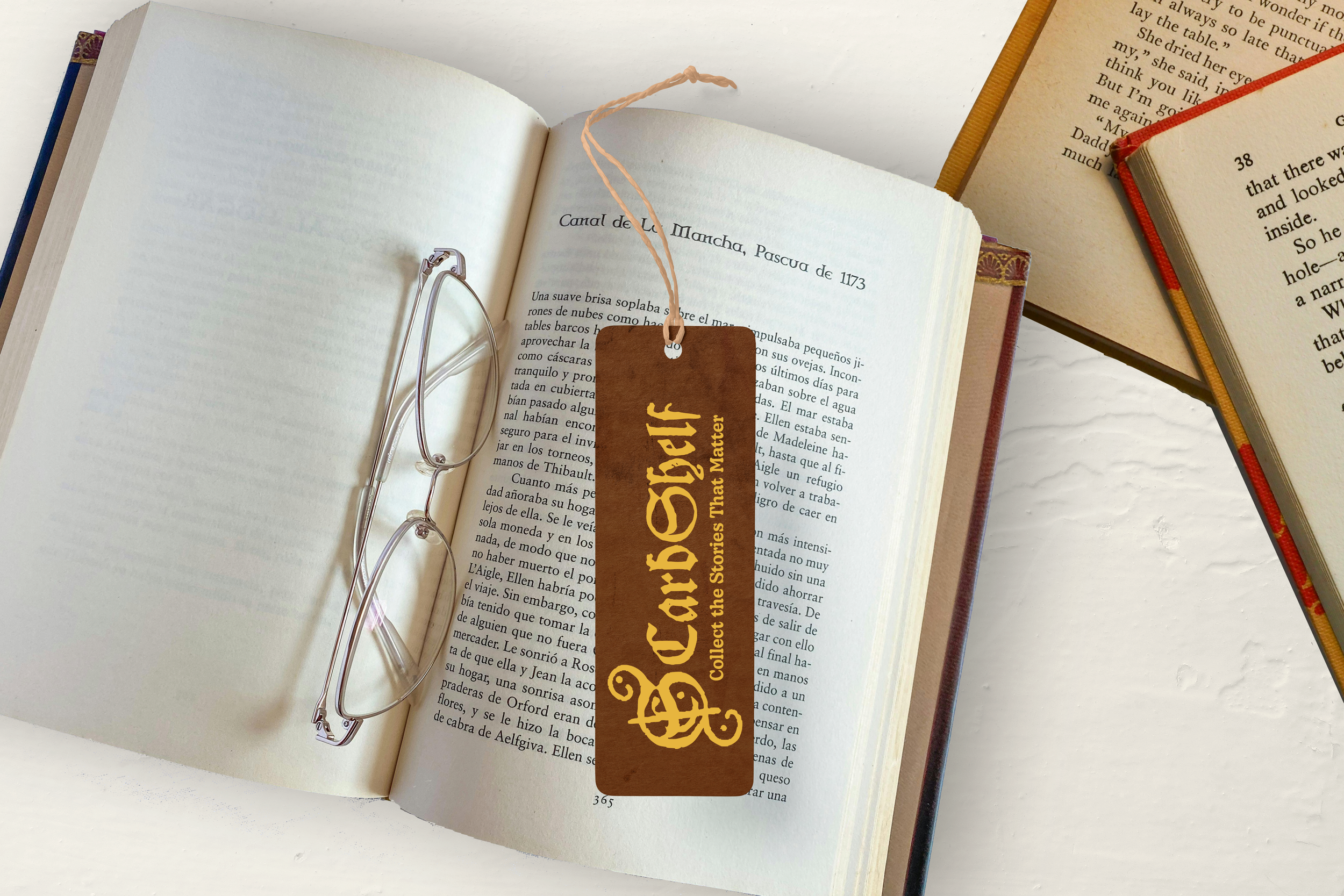
Logo Design: A rune-inspired symbol system that turns words into custom “spells.”
Color Palette: Deep golds, browns, and purples to evoke wisdom and warmth.
Typography: A timeless blackletter font that nods to ancient storytelling.
Website Design: A user-first experience that highlights free resources and community connection.
UX Strategy: Smooth, familiar navigation modeled after major retailers—without losing the mission-driven magic.

We crafted a full brand identity system rooted in the Caregiver and Sage archetypes, blending mystical symbolism, timeless typography, and rich, earthy colors to create a brand world that feels welcoming, wise, and enduring.
bRANDING DESIGN

We designed an intuitive, user-first website experience that mirrors the ease of third-party sellers while building a deeper brand connection through free resources, community storytelling, and strategic calls to action.
WEBSITE DESIGN


MARKETING STRATEGY
We developed a narrative and positioning strategy that reframed CardShelf not just as a bookstore, but as a mission-driven movement, giving the brand a compelling voice to attract socially conscious readers and supporters..

VISUAL LANGUAGE SYSTEM
We created a flexible visual language—combining rune-inspired logos, blackletter typography, and a mystical color palette—giving CardShelf the tools to build consistent, expandable storytelling across digital and physical platforms.


THE RESULTS: BRAND IMPACT
The new CardShelf brand lays the groundwork for long-term growth by blending storytelling, design, and strategy into one immersive experience. The result?
Stronger Connections: Story-driven branding invites readers into a movement—not just a store.
Higher Engagement: A user-friendly site encourages repeat visits and community interaction.
Mission-Aligned Growth: Appeals to socially conscious readers and early adopters.
Scalable Foundation: Built to support CardShelf’s bold five- and ten-year expansion goals.


READY TO REDEFINE
YOUR INDUSTRY?
Schedule your free consultation.